
When internal business software or customer-facing applications fail, leadership teams often point to a lack of employee training or user error. But if your team is constantly fighting the tools they need to do their jobs, it’s rarely a user issue—it’s a software issue.
In enterprise environments, poor User Experience (UX) is a silent tax on productivity, employee morale, and ultimately, your bottom line. When software is frustrating, tasks take twice as long, human errors skyrocket, and onboarding costs balloon.
To protect your software ROI, you need to be able to spot design failures early. Here are the five most common UX red flags in business software, why they happen, and how to fix them.
1. The “Cheat sheet” culture
The Red Flag
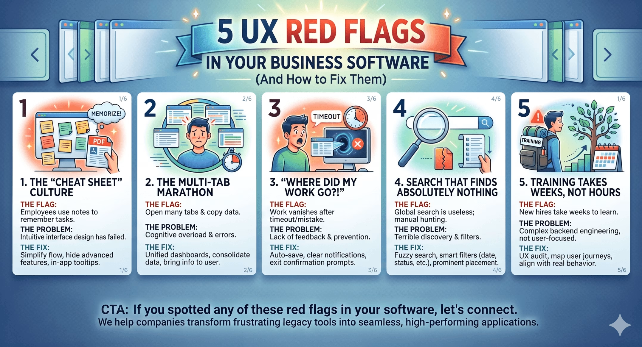
Walk around your office or look at your remote team’s desks. Do you see sticky notes stuck to monitors with step-by-step instructions? Is there a heavily bookmarked, 20-page PDF guide floating around the team Slack channel just to explain how to complete a routine weekly task?
The Problem
If a standard workflow requires a manual to navigate, the user interface design has failed. Software should guide a user naturally through a process; it shouldn’t require an intensive memory test. A “cheat sheet” culture is a definitive symptom of a system that is overly complex, fragmented, or poorly labeled.
The Fix
-
Streamline the flow: Group related actions together and hide advanced features or secondary data fields until they are explicitly needed (progressive disclosure).
-
Contextual guidance: Replace external PDFs with native, in-app tooltips or micro-copy that explains complex fields right where the user is working.
2. The multi-tab marathon
The Red Flag
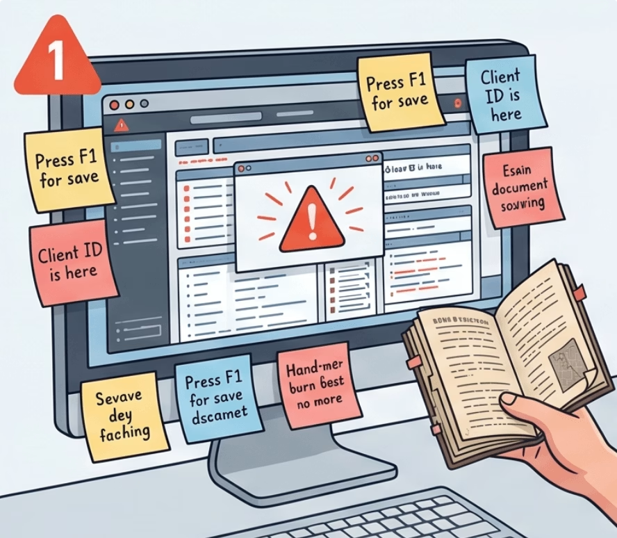
To complete a single, standard business workflow—like onboarding a client or generating a report—an employee has to open six different browser tabs and spend their day copy-pasting data back and forth between them.
The Problem
Fragmented data architectures force users to do the heavy lifting that the software should be doing automatically. This causes severe cognitive overload, slows down task completion rates, and drastically increases the margin for human error during manual data transfers.
The Fix
-
Unified Dashboards: Map out your team’s daily workflows and design unified workspaces that pull information from disparate modules into a single screen.
-
Contextual Actions: Bring the necessary information and actions to the user in a modal or side-panel rather than forcing them to navigate away from their primary workspace.
3. “Where did my work go?!”

The Red Flag
A user spends half an hour meticulously inputting data, updating an account, or writing an internal record. Suddenly, the system times out, or they accidentally click a back button, and everything they just did vanishes entirely into the digital void.
The Problem
This stems from a total lack of system feedback and friction-free error prevention. Great UX assumes that users will make mistakes, their internet will drop, or they will get distracted. If your system does not safeguard their progress, it is actively sabotaging their time.
The Fix
-
Implement Auto-Save: Ensure the system automatically saves drafts in the background as the user types or moves between fields.
-
Friction and Warnings: Introduce clear “Are you sure you want to leave? Unsaved changes will be lost” modal prompts before a user navigates away from an active form.
4. Search that finds absolutely nothing
The Red Flag
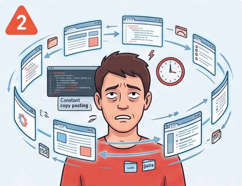
Your platform has a global search bar, yet users choose to manually scroll through endless folders or paginated lists because the search tool is useless unless they happen to know the exact, case-sensitive file name or database ID.
The Problem
Poor data discovery is one of the quickest ways to kill productivity. If your search engine doesn’t account for basic human behavior—like typos, synonyms, or partial phrases—your data becomes effectively trapped.
The Fix
-
Fuzzy Search & Indexing: Upgrade your system to utilise fuzzy search, which recognises intent and surfaces relevant results even if a user makes a typo.
-
Smart Filtering: Provide immediate, intuitive filters (such as date modified, author, or document type) alongside the search bar so users can quickly narrow down vast amounts of data.
5. Onboarding takes weeks, not hours

The Red Flag
When a new hire joins the team, it takes weeks of specialised, one-on-one training just to teach them how to navigate your internal software systems before they can even begin learning their actual job responsibilities.
The Problem
The software was likely built around complex backend engineering logic and database structures rather than real-world human behavior. It forces the human to think like a machine, rather than designing the machine to assist the human.
The Fix
-
Conduct a UX Audit: Map out your actual user journeys. Identify the friction points where new users consistently get stuck or confused.
-
User-Centric Redesign: Reorganise the application’s information architecture so that the navigation paths mimic the natural step-by-step logic of the real-world business tasks they support.
We’re building tech that empowers, not impedes
Great business software shouldn’t feel like a chore, and it shouldn’t be something your team has to “survive” every day. When you invest in fixing these foundational UX flaws, you aren’t just making a prettier interface—you are directly optimising your operational efficiency, reducing costly data entry mistakes, and keeping your team focused on high-value work.
If you spotted any of these five red flags in your current business tools, it might be time to evaluate your application’s design health.
Let’s connect to discuss how a target UX audit can help you transform frustrating software bottlenecks into seamless, high-performing workflows.
#UXDesign #EnterpriseSoftware #DigitalTransformation #TechLeadership #SaaS


